Visualization is an important part of data analysis. To explain and to understand the data we need to draw them in a plot with the respective types of visualization. R provides a powerful capability to draw various types of graphs easily. There are many packages for R users to draw graphs and visualize their data in a meaningful way. In this tutorial, we'll briefly learn some of the basic plotting techniques in R. We'll use several data types to visualize them in various ways. The tutorial covers how to draw the following type chart:
- Lines
- Histograms
- Pies
- Box and Whisker plot
- Scatter plot matrix
Lines
We'll use the Boston housing dataset and we'll start by loading data. If you don't know the dataset content you can check it by str() command.
boston = MASS::Boston
str(boston)
Now we'll draw a plot and add lines into it by changing the type of line and color.
x = 1:nrow(boston)
plot(x=x, y=boston$zn,  type="l", col="red",
     main="Boston dataset", xlab="count", ylab="records")
lines(x, boston$medv, type="o", col="blue", pch=19)
lines(x, boston$indus, type="b", col="burlywood", pch=21)
legend("topright", legend = c("zn", "medv", "indus"),
       col = c("red", "blue", "burlywood"),
       lty = 1, cex = 0.9, lwd = 2, bty = 'n')

Histogram
hist(boston$medv, col="blue")

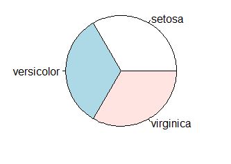
Pies
data(iris)

agg = aggregate(x=iris$Species, by=list(category=iris$Species), FUN=length)
print(agg)
    category  x
1     setosa 50
2 versicolor 50
3  virginica 50
pie(agg$x, agg$category)
Box and Whisker plot helps to visualize the distribution of data.
boxplot(iris[,1:5], main="Box and Whisker Plot")

Scatter plot matrix
The scatter plot matrix visualizes the relationship between variables in a data.
pairs(iris)

In this tutorial, we've learned how to draw plots with R.
No comments:
Post a Comment